
Duration
Team

How it all started
1
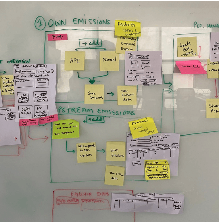
The forgotten PCF form
The old team made the form years ago without involving designers; it was a quick, temporary solution with no updates since.
2
A Maze of confusion
Users struggled with confusing language and poor structure, leading to frequent errors and incomplete submission
3
Loss of Trust
High error rates frustrated users and damaged trust, highlighting the need for a more intuitive experience.
4
Time for Rethinking
Redesign was initiated to improve usability, reduce errors, and align the form with our current product standards.
Key questions we asked our users
Can you walk us through how you currently fill out the PCF form?
Have you ever made errors while filling it out? If so, where and why?
Have you ever abandoned the form before completing it? Why?
What parts of the form do you find confusing or unclear?
What improvements would make the form easier or faster for you to complete?


Error Recovery

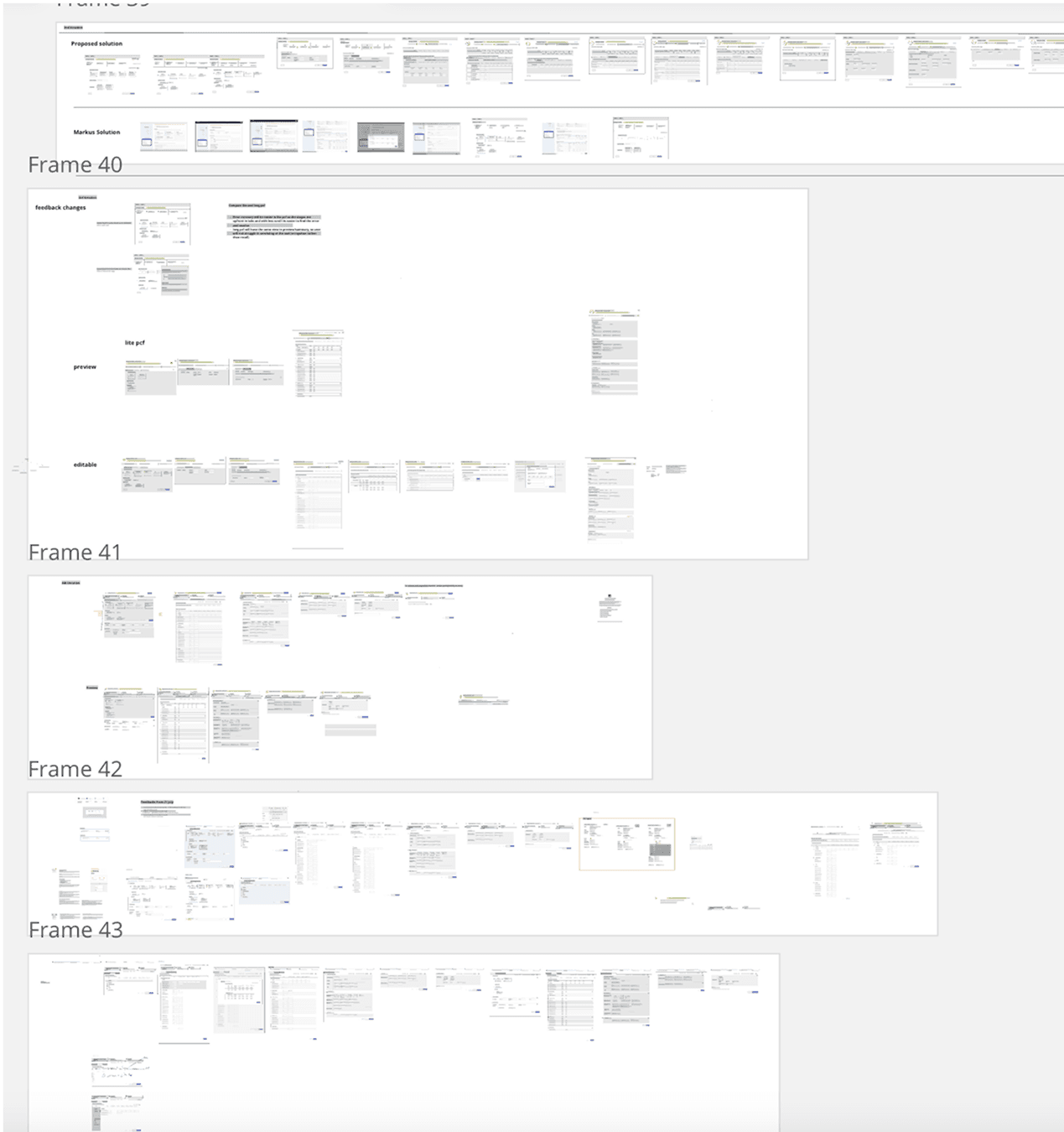
PCF Preview


Impact
Reduced Time taken - Time taken to fill the PCF form now was reduced by 50%
Increased Efficiency - Reduced task steps by 30-40% through layout optimization and autofill
Reduced Error Rates - It contributed to a significant reduction in user errors and faster recovery from errors.
Next Steps
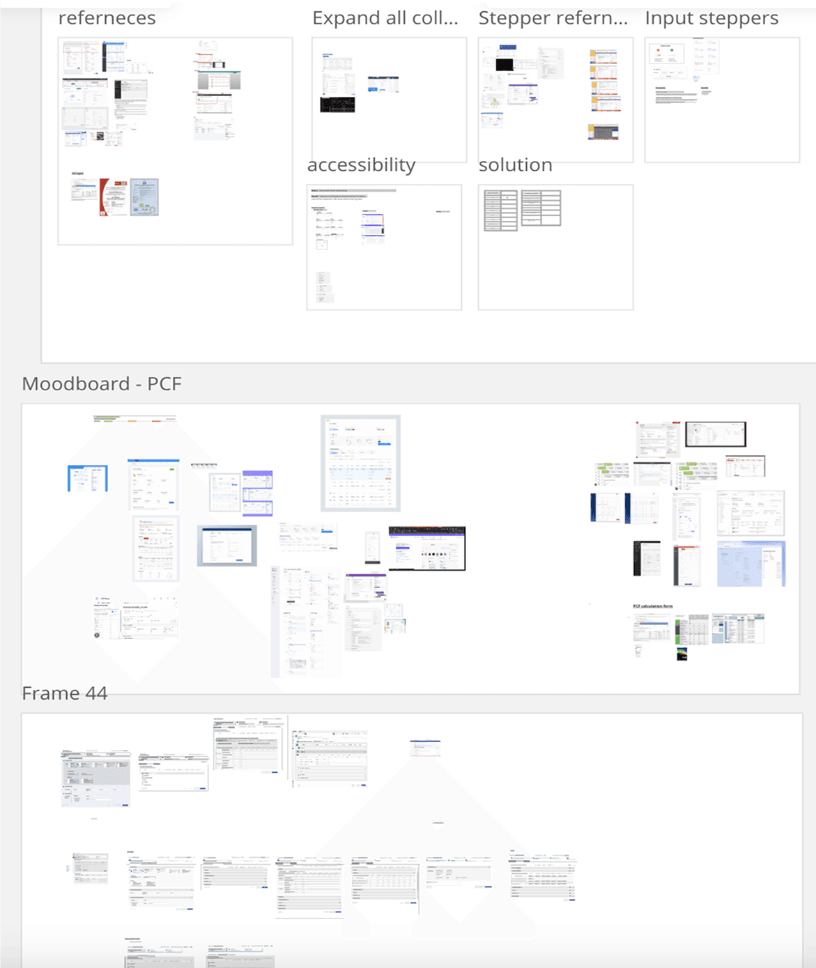
While we tried our best to use the iX design system and check for accessibility issues, testing the performance in real scenario would be important to find hidden interaction problems
Learnings & Takeaways
Overall my experience working with one of the main aspect of the product was challenging as well as gratifying. This journey rewarded me with some valuable learnings.
Cross Collaboration and communication
I learned the importance of effective collaboration and communication with stakeholders, including developers, product managers and other team members, throughout the design process to align on goals, requirements, and feedback.
Continuous improvement mindset
The iterative design process highlighted the importance of embracing a continuous improvement mindset, where design decisions are informed by user feedback, usability testing, and iterative refinement to ensure ongoing enhancements and optimizations