Overview

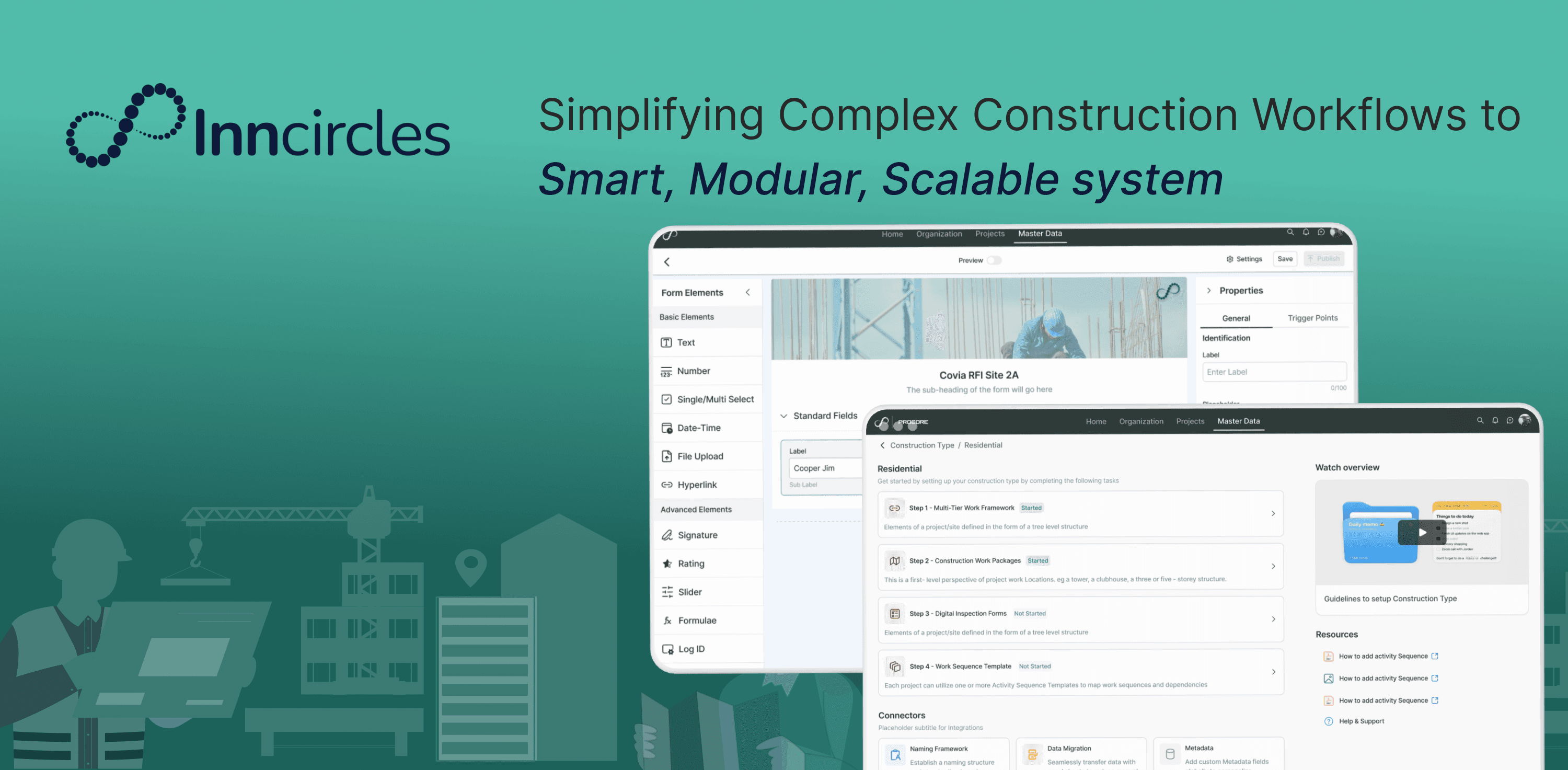
Construction teams needed a developer every time a form had to change. This is the redesign that let them build it themselves.

Duration

Duration

Aug 2024 - May 2025

Aug 2024 - May 2025

Team

Team

2 Product Designers (me + 1 senior) · 1 Product Manager · 1 Business Analyst

My Role

My Role

  • Design lead on the Form Builder redesign — end to end, from user research and heuristic audit through interaction design and prototyping. Partnered daily with a PM and business analyst to align rollout phases and keep the system consistent as it scaled.

Anticipated Impact

50%

50%

50%

0%

Reduced support dependency

Reduced support dependency

70%

70%

70%

Increased Completion Rate

Increased Completion Rate

80%

80%

80%

Anticipated Lower UI Bug Rate

Anticipated Lower UI Bug Rate

The platform was feature-rich but experience-poor — and forms were the clearest example.

Inncircles is a B2B construction management platform for contractors, project managers, and on-site engineers — covering vendors, materials, approvals, and site logs end to end. It was feature-rich but experience-poor: an outdated interface made even basic tasks hard to complete without help, and first-time users had no sense of guidance or feedback.

After joining the team, I ran a heuristic audit across 12 core flows and found the pattern everywhere: inconsistent components, poor hierarchy, confusing workflows. Design debt made onboarding hard and retention harder — the business wanted more client self-sufficiency and lower support costs. Forms were the clearest, highest-leverage place to prove it could work.

Goals

Goals

Usability for both new and power users

User goal

Self-serve flows, less dependency on support

Business goal

Handle edge cases without cluttering the base flow

User goal

Rebuild from a systems-thinking, logic-first lens

Business goal

Over the next sections, I’ll walkthrough the major revamp initiatives I led and designed:

Over the next sections, I’ll walkthrough the major revamp initiatives I led and designed:

Forms were static, and every change needed a developer.

In construction management, forms are central in workflows like RFIs, inspections, material requests, safety checklists and construction teams want these forms tailored to their process. But our legacy form setup was static and required dev intervention for even small changes. This slowed down users, reduced flexibility for teams in the field, and increased support load.

In construction management, forms are central in workflows like RFIs, inspections, material requests, safety checklists and construction teams want these forms tailored to their process. But our legacy form setup was static and required dev intervention for even small changes. This slowed down users, reduced flexibility for teams in the field, and increased support load.

However, the existing builder had inconsistent, hard-to-maintain patterns scattered across modules — each team had built its own rigid variant, with no real-time feedback and every conditional rule hardcoded by a developer nobody could reach in time.

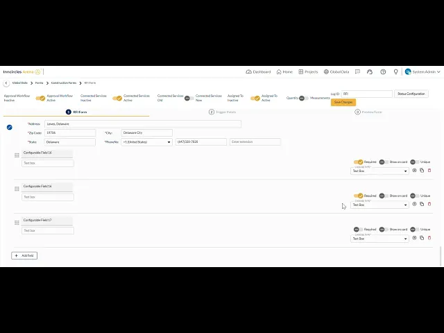
The old builder crammed everything onto one screen with zero hierarchy.

I built a form myself first, and immediately saw why clients were frustrated.

My first step was experiencing the system as a user would. So I tried setting up forms myself using the existing system. It quickly became clear why clients were frustrated:

My first step was experiencing the system as a user would. So I tried setting up forms myself using the existing system. It quickly became clear why clients were frustrated:

Usability Issues

Usability Issues

No hierarchy, one crowded screen

Dev-only toggles up top

Unlabeled toggle wall

Cramped, ungrouped properties

Silent breaks on type change

No mobile preview

What users said

What users said

Usability Session Feedback
I have to open multiple dropdowns for options I use daily. It’s tiring and repetitive
Usability Session Feedback
"To add one sub-entity, I go through so many to start editing a form & multiple confirmations, I lose context & it’s exhausting"
Support Tickets
"I tried using it on my tablet at the site, but it’s not responsive. I have to scroll endlessly"
Support Tickets
"I tried using it on my tablet at the site, but it’s not responsive. I have to scroll endlessly"

I benchmarked three tools to see what patterns users had already internalized — and where they'd break for construction.

I benchmarked leading form tools like Jotform and Typeform and construction-focused platforms like Procore to understand what patterns users had already internalised and where those patterns broke down for construction-specific needs.

Jotform showed me how powerful a drag-and-drop canvas could be when paired with a persistent field library, users never had to hunt for what they needed; everything was visible and accessible in one place.
Typeform, on the other hand, taught me what not to do for this context: its one-question-at-a-time flow works beautifully for consumer surveys, but construction forms are reviewed, referenced, and filled in non-linear ways on-site. A linear wizard would have been the wrong model entirely for our users.
Procore was the most instructive, it showed me that construction professionals are comfortable with complex, data-dense interfaces, but only when the hierarchy is predictable and the labels match their domain language.
Where Procore fell short was in configurability: admins couldn't change field behaviour without engineering support, which was exactly the problem we were solving

ADOPTED

Jotform

Drag-and-drop canvas + persistent field library — nothing to hunt for

AVOIDED

Typeform

One-question-at-a-time wizard — wrong model for non-linear, on-site work

PARTIAL

Procore

Proved dense hierarchy works if predictable — but configurability needed engineering

Six patterns kept surfacing, and none of them were about missing features.

Six patterns kept surfacing, and none of them were about missing features.

01

Built for developers, not construction teams

02

No safety net — one wrong click could break a field

03

Ten steps for what should've been a two-minute task

04

Never tested on the devices people carry on-site

Reframing the problem

How might we empower non-technical users to build complex, responsive forms with confidence without sacrificing construction-related workflows?

How might we empower non-technical users to build complex, responsive forms with confidence without sacrificing construction-related workflows?

None of this was a visual problem — it was an information design problem.

These insights made it clear we didn't just need better visuals — we needed to rethink how users create, edit, and preview forms, because every dev-dependent tweak was a support ticket and a delay for the client. Based on what we learned from users, stakeholders, and our own audit, I worked with the PM and engineering team to define key design goals for the new Form Builder:

Design Principles

Design Principles

01

WYSIWYG — the canvas always shows exactly what ships

02

Guided by default, flexible on demand

03

Every change previews before it publishes — nothing breaks silently

04

Responsive from the first field, not bolted on after

Here's how those principles became the new Form Builder.

A WYSIWYG builder, not a config form.
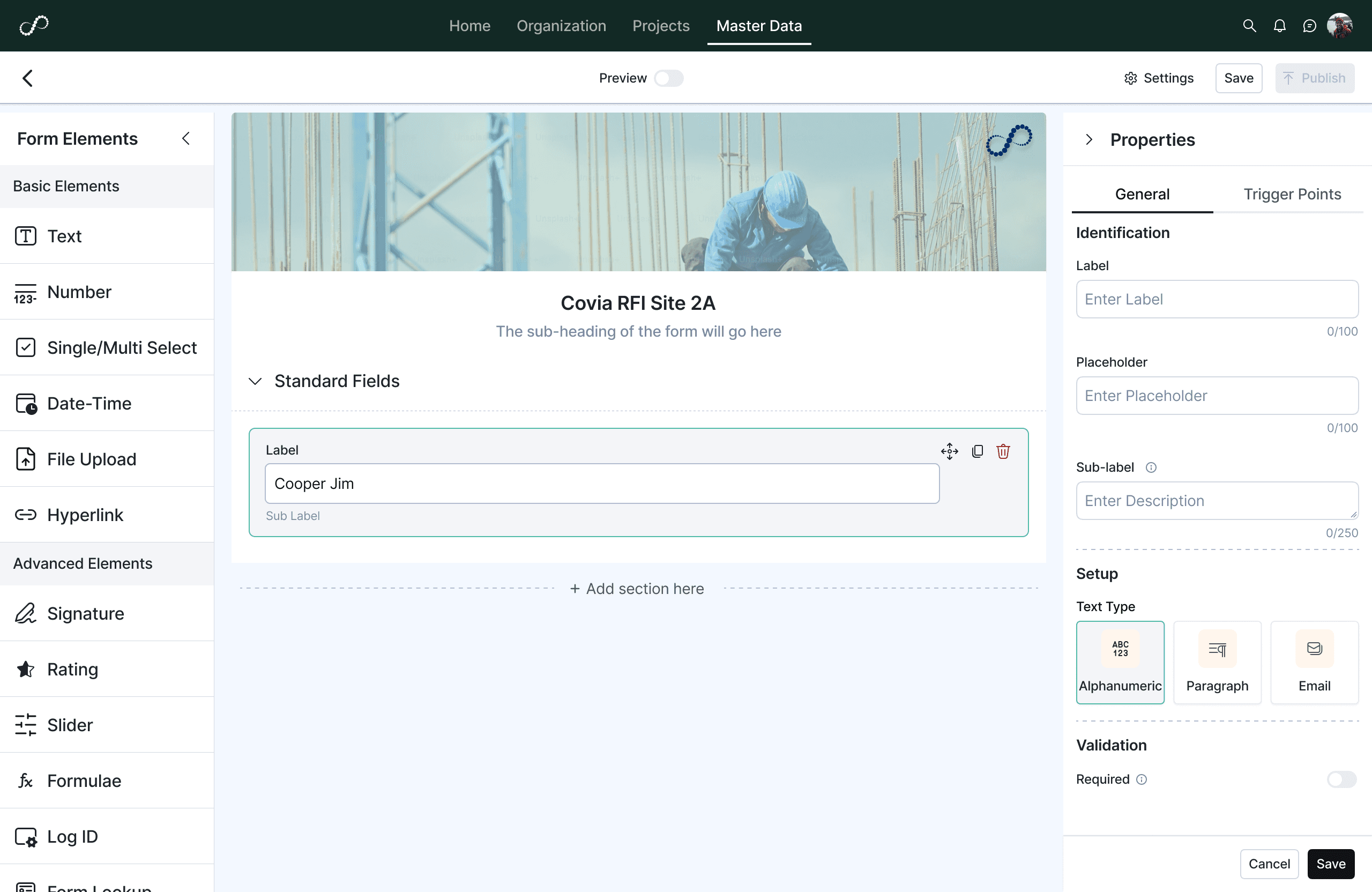
My core idea was to shift from a static, developer-focused form definition page to a dynamic, visual, WYSIWYG (what you see is what you get) builder one that gave users full control while guiding them with a clear structure. That landed me on a three-panel layout:

This let users focus on one task at a time without overwhelming them.

My core idea was to shift from a static, developer-focused form definition page to a dynamic, visual, WYSIWYG (what you see is what you get) builder one that gave users full control while guiding them with a clear structure. That landed me on a three-panel layout:

This let users focus on one task at a time without overwhelming them.

Left - Fields Library

Left

Fields Library

Center - Form canvas

Center

Form canvas

Right- Contextual Properties Panel

Right

Contextual Properties

Every field type ships with its own rules, not a generic text box.

Form elements contain all the fields library segregated by
Basic, Advanced, Section and Arena Field, which is specific to fields specially used by Inncircles and will grow in future releases.

Form elements contain all the fields library segregated by
Basic, Advanced, Section and Arena Field, which is specific to fields specially used by Inncircles and will grow in future releases.

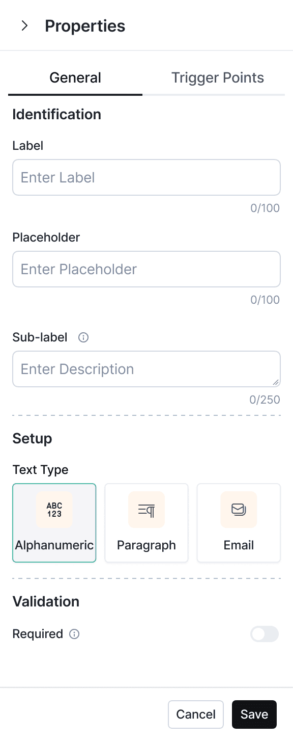
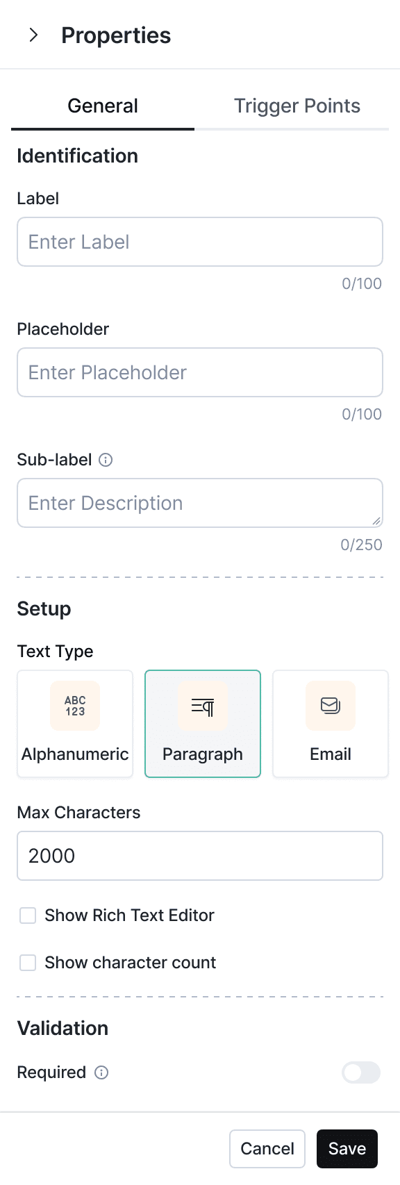
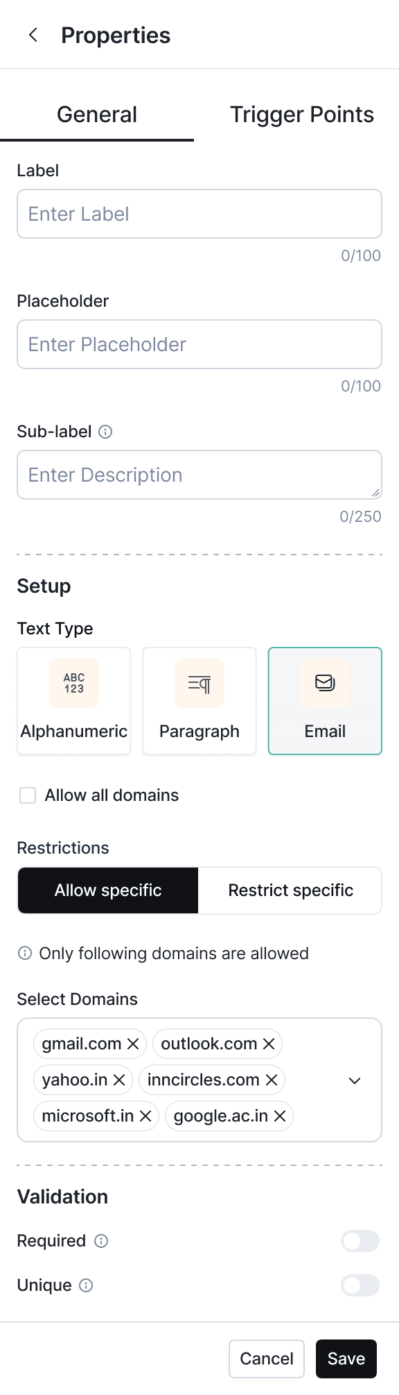
Text

The Text property in the new form builder supports :

Alphanumeric – simple free text input for names, IDs, notes.

Paragraph – long-form responses with optional rich text editing and max character limits.

Email – validated email input with advanced domain restriction rules.

Clear, type-specific setup with intuitive controls (max characters, domain rules) ensures better data integrity, faster error-free creation, and higher client confidence.

The Text property in the new form builder supports :

Alphanumeric – simple free text input for names, IDs, notes.

Paragraph – long-form responses with optional rich text editing and max character limits.

Email – validated email input with advanced domain restriction rules.

Clear, type-specific setup with intuitive controls (max characters, domain rules) ensures better data integrity, faster error-free creation, and higher client confidence.

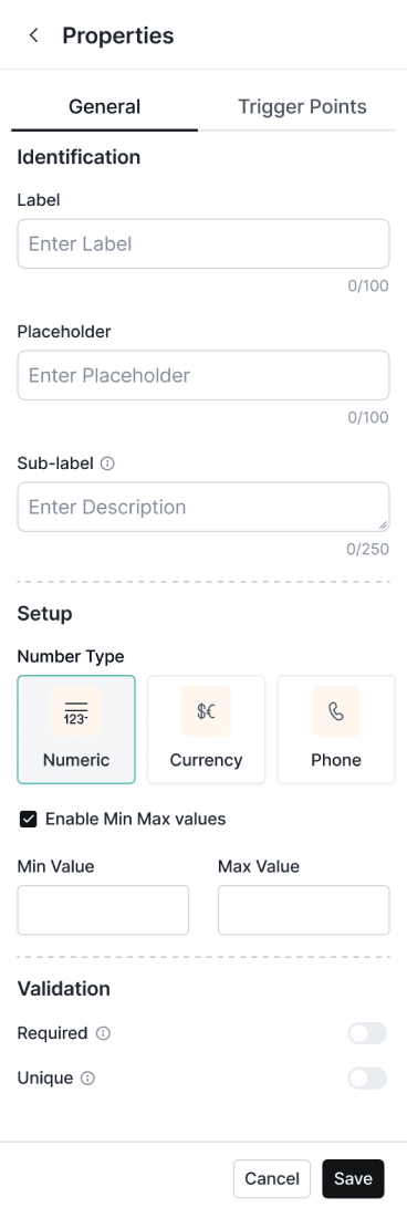
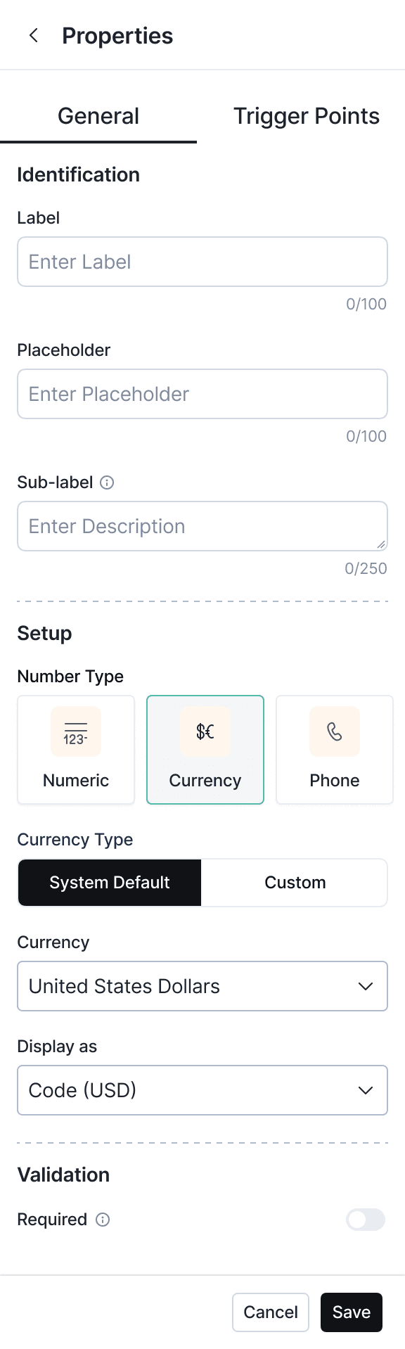
Number

Includes Numeric, Currency, and Phone types with options for min/max limits, currency selection, and formatting.
Helps teams capture validated, precise, and region-specific data easily while reducing manual errors and setup complexity.

Includes Numeric, Currency, and Phone types with options for min/max limits, currency selection, and formatting.
Helps teams capture validated, precise, and region-specific data easily while reducing manual errors and setup complexity.

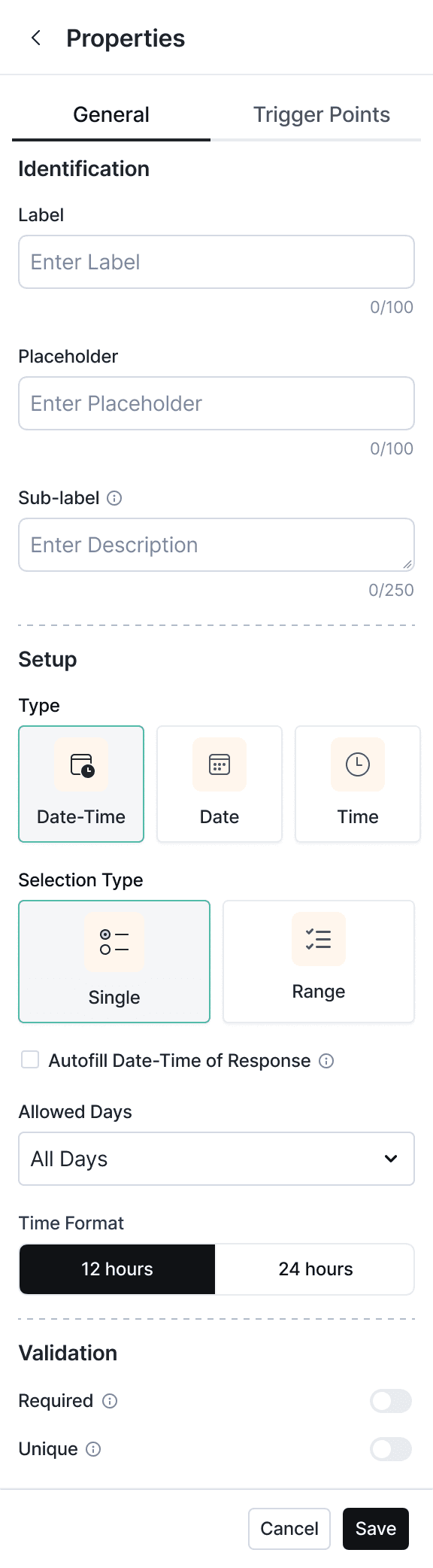
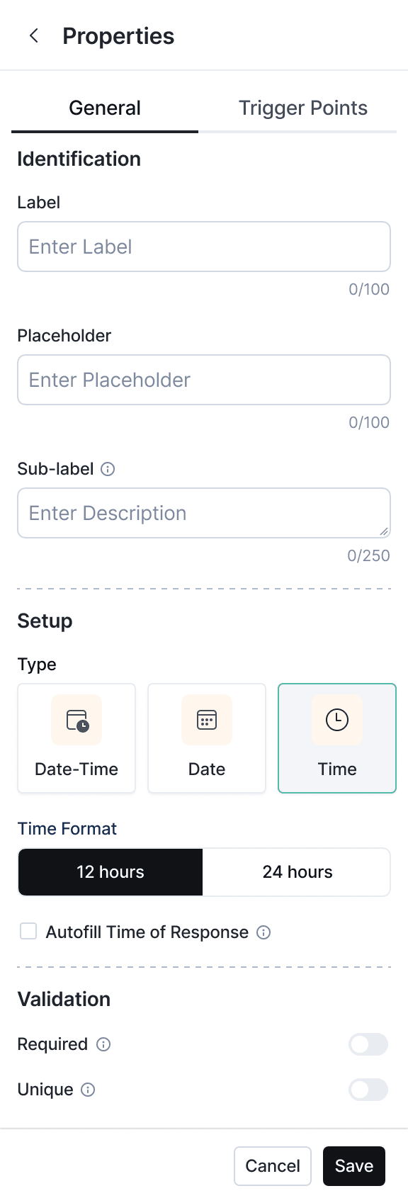
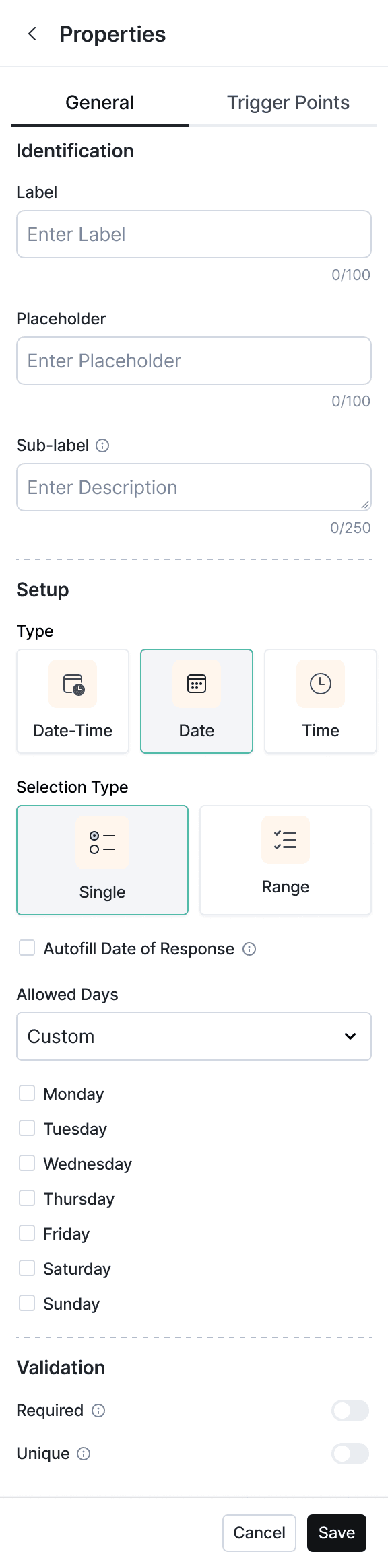
Date

Supports Date, Time, and Date-Time inputs with single/range selection, time formats, and allowed days.
These granular controls are especially useful for scheduling tasks, setting deadlines, or capturing timestamps in workflows. By tailoring input to the context, it improves data consistency and eliminates back-and-forth for corrections.

Rating
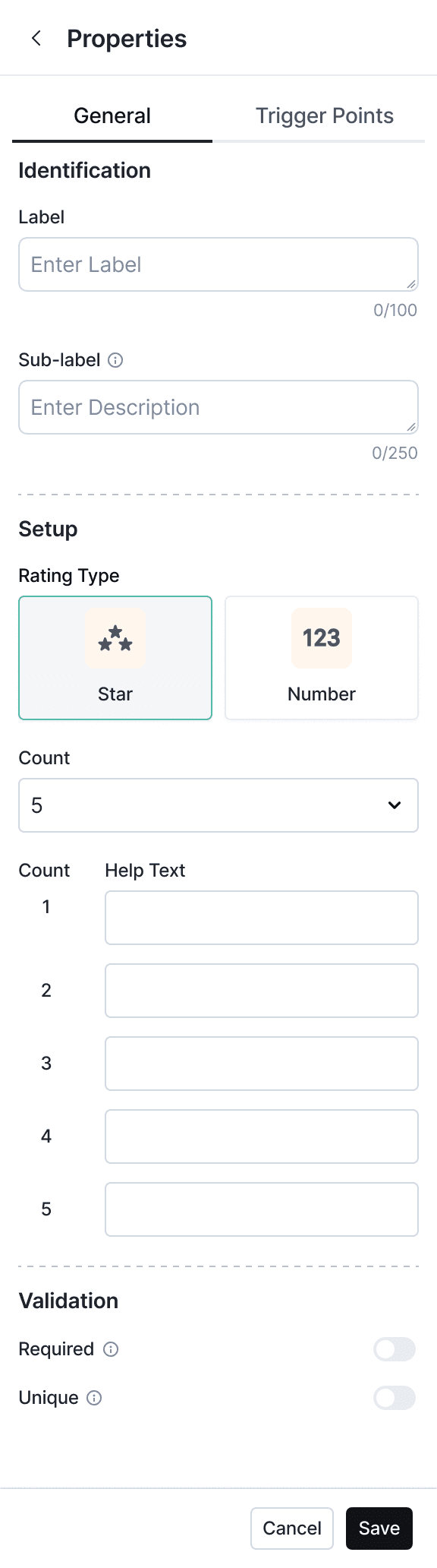
The Rating property supports both star-based and numeric scales, with customizable count and help text for each level.
By letting form creators define their own scale and guidance, it ensures responses are meaningful, consistent, and easy to interpret across teams.

The Rating property supports both star-based and numeric scales, with customizable count and help text for each level.
By letting form creators define their own scale and guidance, it ensures responses are meaningful, consistent, and easy to interpret across teams.

Drag, drop, preview — no guessing how it'll look.
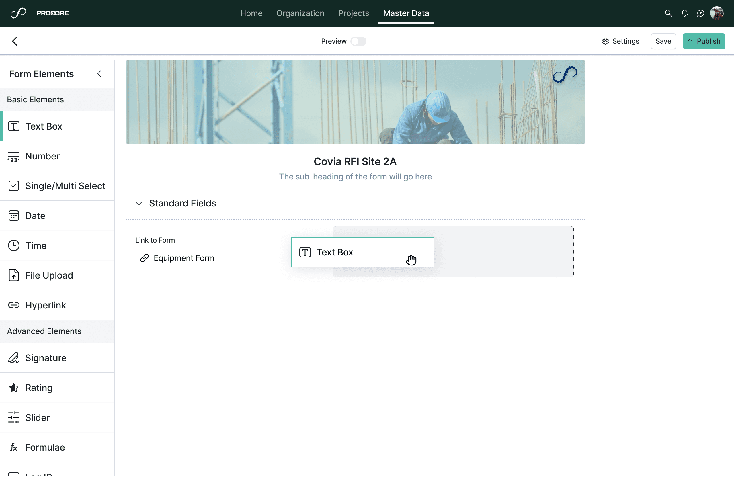
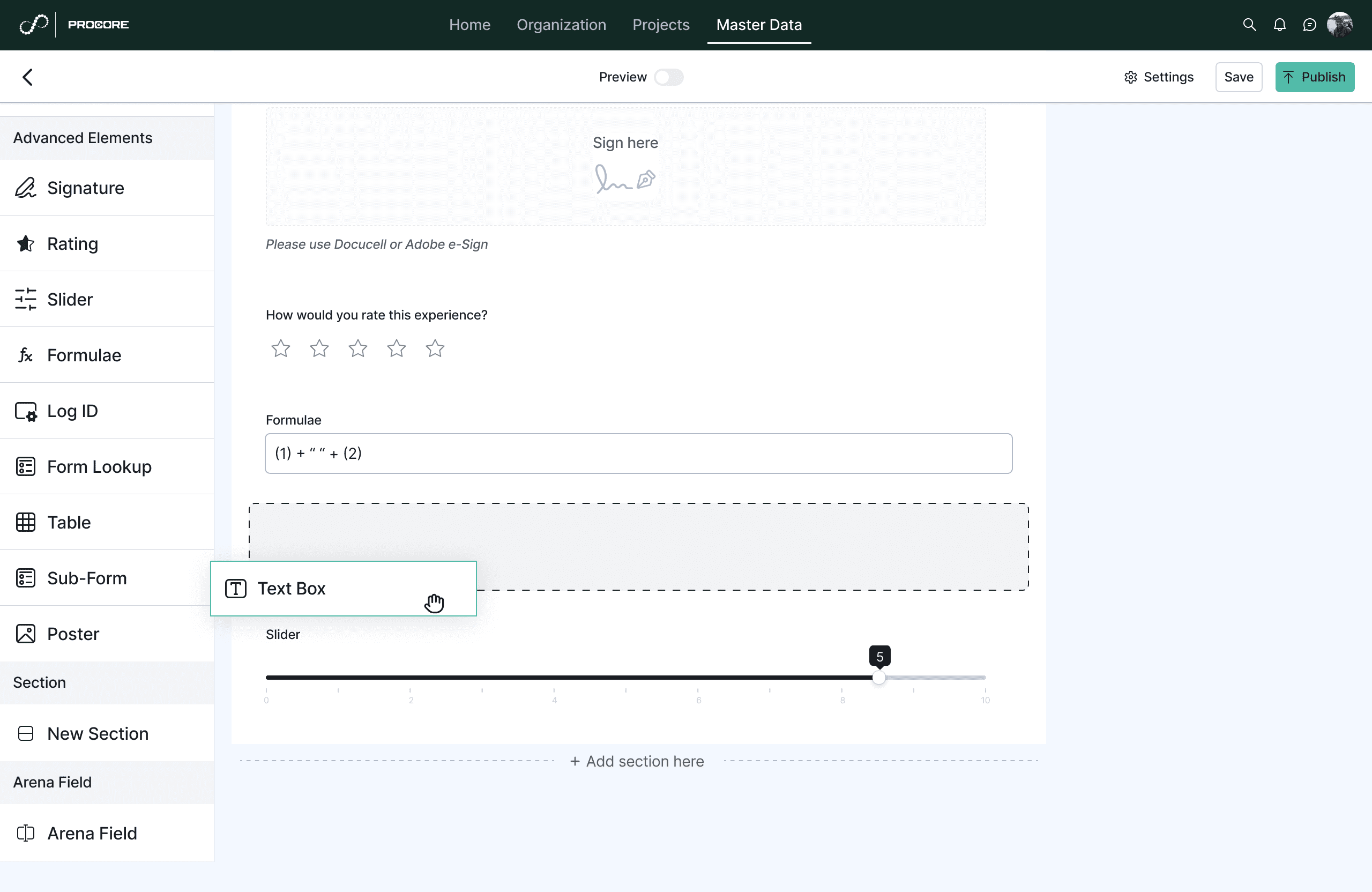
Drag Elements

Drag Elements

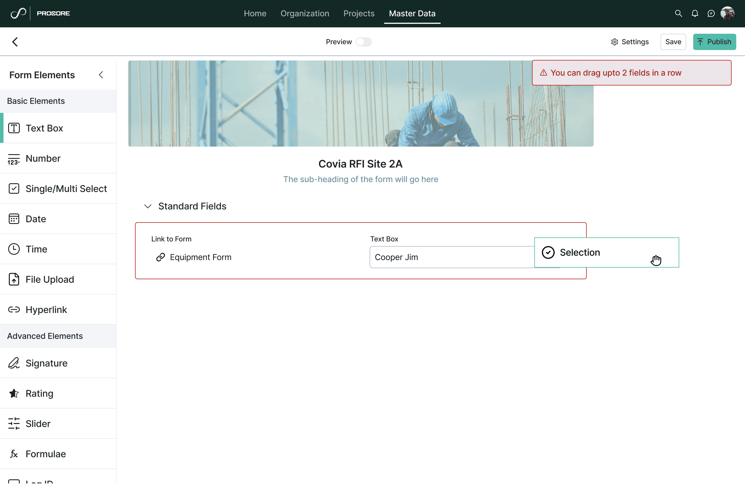
Dragging fields next to each other in a row

Dragging fields next to each other in a row

Dragging fields above/below other fields

Dragging fields above/below other fields

Dragging more than 2 fields in a row is restricted due to overload of data

Dragging more than 2 fields in a row is restricted due to overload of data

Preview

Preview

Shows how the form will appear in different devices

Shows how the form will appear in different devices

Settings

Settings

Configuring the form approval workflows, ID settings, themes and the thank you pages

Configuring the form approval workflows, ID settings, themes and the thank you pages

My learnings & Reflections

  • It showed the value of collaborating deeply with PMs and SMEs to understand system constraints early & using them to shape better experience.

  • Perks of being new to the domain- Being new to the construction domain was both a challenge and an advantage, I brought an unbiased perspective that helped surface assumptions the team had normalised


  • This project reinforced for me that enterprise UX is not about redesigning legacy flows, it’s about translating complex, technical systems into understandable, usable workflows.

My biggest learning:
You don’t just design flows, you design understanding.

  • It showed the value of collaborating deeply with PMs and SMEs to understand system constraints early & using them to shape better experience.

  • Perks of being new to the domain- Being new to the construction domain was both a challenge and an advantage, I brought an unbiased perspective that helped surface assumptions the team had normalised


  • This project reinforced for me that enterprise UX is not about redesigning legacy flows, it’s about translating complex, technical systems into understandable, usable workflows.

My biggest learning:
You don’t just design flows, you design understanding.

Curious to know more?

This is one part of a larger platform revamp — happy to walk through the Construction Setup redesign or the research behind it if you're interested. See more of my work below.