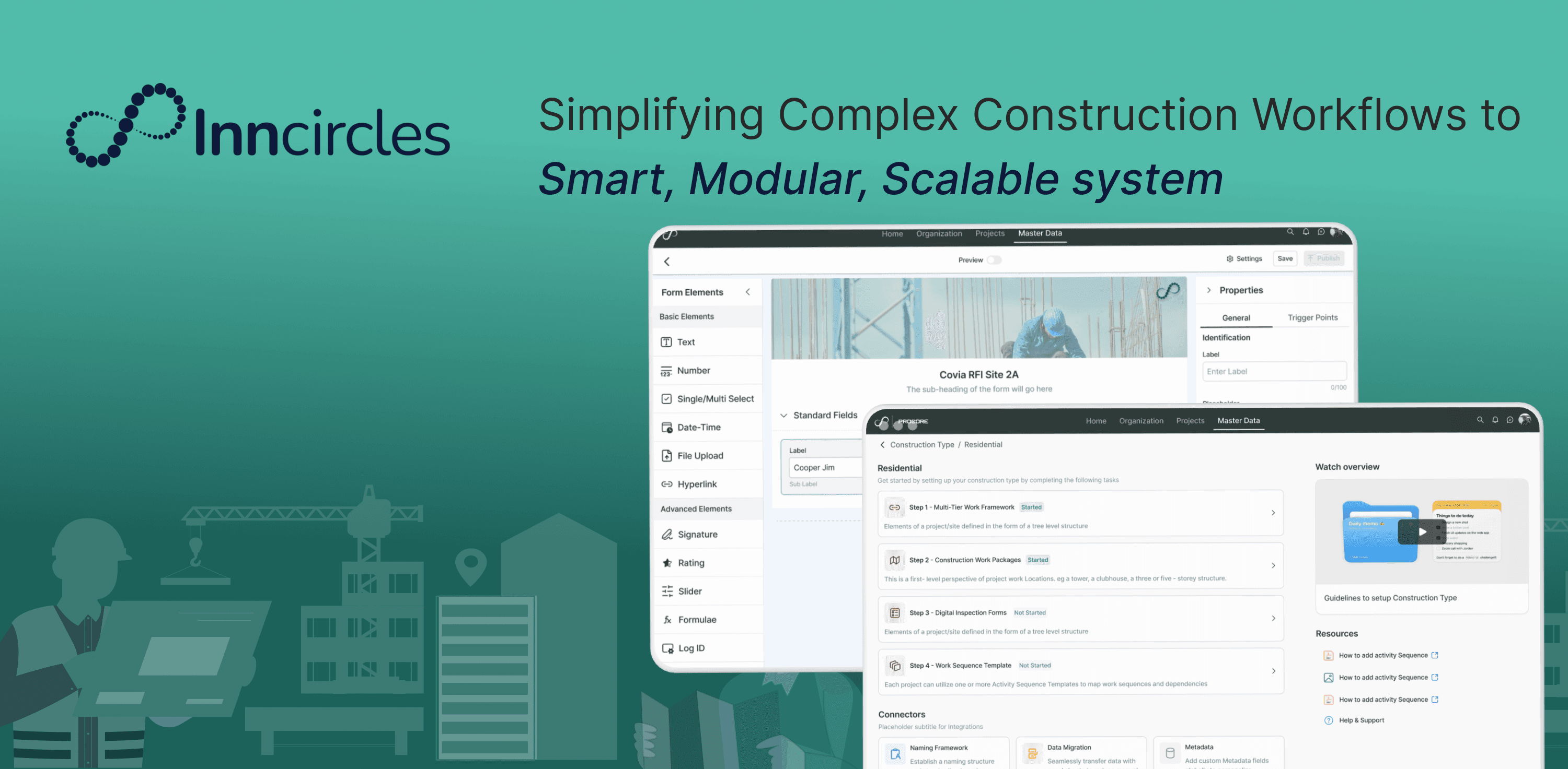
Overview
At Inncircles, no client could start a project until someone on our team built its structure by hand. I redesigned that setup so they'd never need us to.
Anticipated Impact
Projections modelled from internal usability testing and stakeholder review. The redesign is validated and slated for build — these are targets, not shipped results.
01 — DISCOVER
The platform was feature-rich but experience-poor — and it was costing the business.
Inncircles is a B2B construction platform — vendors, materials, approvals, and site logs, end to end. Powerful, but hard to use: even basic setup needed our support team's help.
A heuristic audit across 12 flows surfaced the same root issues everywhere. The business wanted to flip the model — clients self-sufficient, support costs down — and Construction Setup was the highest-leverage place to prove it.
Construction Setup is where every project starts, it structures every site, task, and material. Here's the flow clients faced before the redesign.
The old flow: three disconnected screens, no way to preview a change.
The legacy flow, in two minutes: three disconnected columns, no progress indicator, no way to preview a change before publishing it.
I went straight to the people fielding the tickets.
I paired the heuristic audit with direct input from the people closest to the pain: the internal support and onboarding teams who were manually setting this up for clients every week.
It was built for a database schema, not a construction manager's brain.
The flow was built from the internal database's structure, not the user's mental model. Clients had to define a deeply nested hierarchy — Entity Types → Super Location Types → Location Types — then map Activities, Work Packages, and finally Materials & Labor. It read like it was designed for engineers, not for the construction managers who actually use it.
Five separate screens. No shared context, no way back.
Clients couldn't use it on their own. Our internal team had to set it up for them by hand, every time — which meant slower onboarding for every new client, and support costs that kept climbing to cover the gap.
Four failure points explained nearly every support ticket.
Each of those four points mapped to a category of support ticket. This wasn't abstract UX friction — it was the onboarding team's weekly workload.
02 — REFRAME
It wasn't a interface problem. It was a translation problem.
How might we let a construction manager set up a project's entire hierarchy — however complex — clearly, and with confidence? The job was translating expert domain knowledge into something anyone could follow.
FROM DATABASE STRUCTURE → TO A MENTAL MODEL
03 — DESIGN & BUILD
My first draft got rejected by the people who'd use it every day.
My first attempt got real pushback from the people who'd use it daily — and it reshaped the whole solution.
"[PLACEHOLDER — replace with real wording] They don't want to be handheld through their fifth project. They just want to get in and build." — Onboarding team lead
I'd over-indexed on new-user anxiety and underweighted the power user. The fix wasn't a better wizard — it was letting the flow branch by who's using it.
Solution
With the four principles set, here's what shipped — reviewed continuously with PMs and analysts so bulk operations and edge cases held up against how these teams actually work, not just how they looked in Figma.
The redesigned flow in action — from creating a construction type to defining multi-tier hierarchies and sequence templates.
Step 1: Starting from a template beats a blank canvas.
Clients start by naming the construction type and choosing a base template — closing the gap between a blank canvas and a production-ready setup.
Design decision — progressive disclosure: start with one choice, the template, not the whole hierarchy.
Step 2: The hierarchy stays visible the whole time you're building it.
The old flow showed 3 disconnected columns with no nesting. This view makes the parent-child hierarchy visible and editable at every level, so managers can see the whole structure as they build it.
Design decision — clarity: nesting stays visible and editable at every level, never hidden behind a modal.
Activities and work packages attach directly to the level they belong to, instead of a separate, disconnected config screen — keeping "this task lives here" intact instead of splitting it across pages.
Design decision — kept every task anchored to the level it belongs to, instead of routing it through a separate config screen.
Step 4: Returning users skip the rebuild entirely.
Sequence templates let returning users skip rebuilding a hierarchy from scratch for similar projects — the direct, collapsable path for power users the onboarding team asked for.
Design decision — guided, but skippable: the direct path for returning users the pivot revealed we needed.
04 — VALIDATE
Onboarding and support confirmed it fixes what was actually breaking.
This is one piece of a larger, phased platform revamp — sequenced across quarters so the business keeps running while it ships.
I pressure-tested it with product, engineering, business, and the onboarding team who do this setup by hand today. They confirmed it resolves the top support issues — and early client feedback flagged the step-by-step guidance and bulk import as the biggest wins.
My learnings & Reflections
Curious to know more?
This is one part of a larger platform revamp — happy to walk through the Form Builder redesign or the research behind it if you're interested. See more of my work below.