Making complex carbon reporting 70% faster in Siemens - SiGREEN

Making complex carbon reporting 70% faster in Siemens - SiGREEN

TL;DR

WhatRedesigned SiGREEN's Product Carbon Footprint creation flow, restructuring a dense standards-led form into a guided workflow with clearer progress, validation and data-quality feedback
WhyUsers struggled to understand technical fields, locate errors and judge whether the data they entered was good enough to share. Because that data feeds the PCF exchanged across SiGREEN's supply-chain network, usability problems also became data-quality problems
My roleProduct/UX Designer - I owned the end to end redesign of the PCF creation experience, from auditing the existing PCF workflow and synthesising client feedback through interaction design, prototyping and usability testing. I worked with the Lead UX Designer, Product Owner and engineering team throughout delivery
Team1 Lead UX Designer ยท 1 UX Designer (me) ยท 1 Product Owner ยท 4 Developers
Duration6 months within my 2022โ€“24 SiGREEN engagement

Impact

Impact

0%
0%

Reduced time taken

Reduced time taken

0%
0%

Reduced task steps through layout optimisation and autofill

Reduced task steps through layout optimisation and autofill

Measured against the original experience in moderated usability testing.

The PCF form is the backbone of SiGreen, but it is only useful if the data behind it can be trusted

The PCF form is the backbone of SiGreen, but it is only useful if the data behind it can be trusted

SiGREEN is Siemens' open, blockchain-secured network for sharing trusted product carbon footprints across the supply chain.
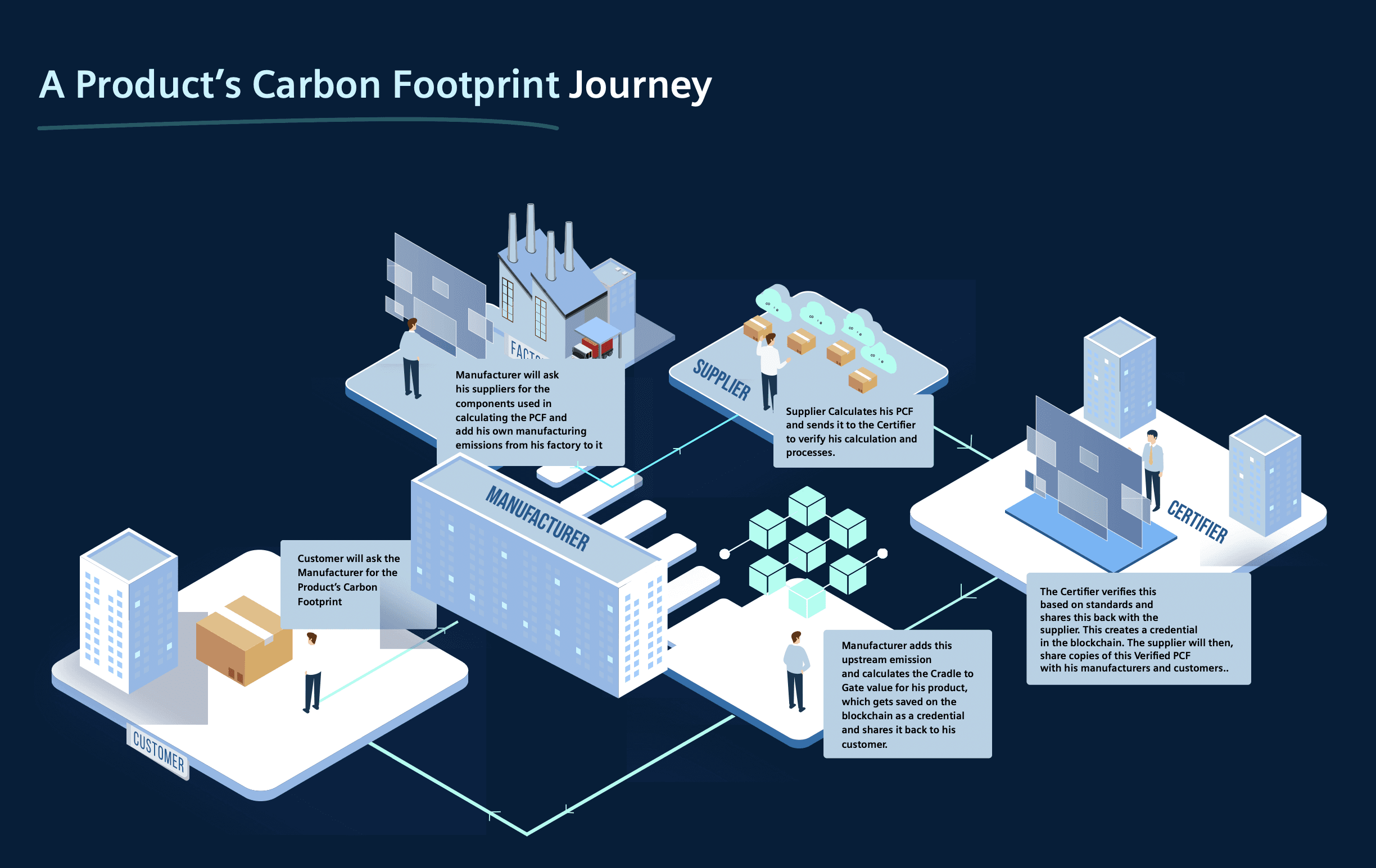
SiGREEN helps companies create and exchange Product Carbon Footprint (PCF) data across their supply chains. The creation form is where that information enters the network: company details, product data, lifecycle emissions, calculation methodology and verification.


That made the form both a usability problem and a data-integrity problem. Making it easier could not mean removing information required by the reporting standards SiGREEN supports.

The Challenge

The Challenge

How might we

reduce the effort of creating a PCF without reducing the quality of the data being submitted?

Goals

Two things had to improve together: completion and data quality

Two things had to improve together: completion and data quality

User goalComplete a PCF without relying on training or external guidance
Business goalPreserve the quality and completeness of data entering the network
User goalUnderstand progress, requirements and unfamiliar terminology while working
Business goalSupport evolving emission types and reporting requirements without repeatedly restructuring the flow

The original workflow had grown harder to use as the product matured

The original workflow had grown harder to use as the product matured

The existing PCF flow exposed users to a large number of technical fields and nested substages with little support for understanding what was required. Errors were difficult to trace, terminology frequently pushed users outside the product for help, and the structure treated every section with similar visual weight

I combined existing customer evidence with an audit of the live workflow

Client research

Reviewed and synthesised interviews conducted by a dedicated research team, focusing on pain points during PCF creation and data entry.

Expert UX audit

Walked the complete PCF workflow screen by screen, logging friction, inconsistencies, and error-prone steps.

Usability testing

Conducted interviews with eight existing SiGREEN users (five internal, three from supplier companies) to validate audit findings and uncover additional issues.

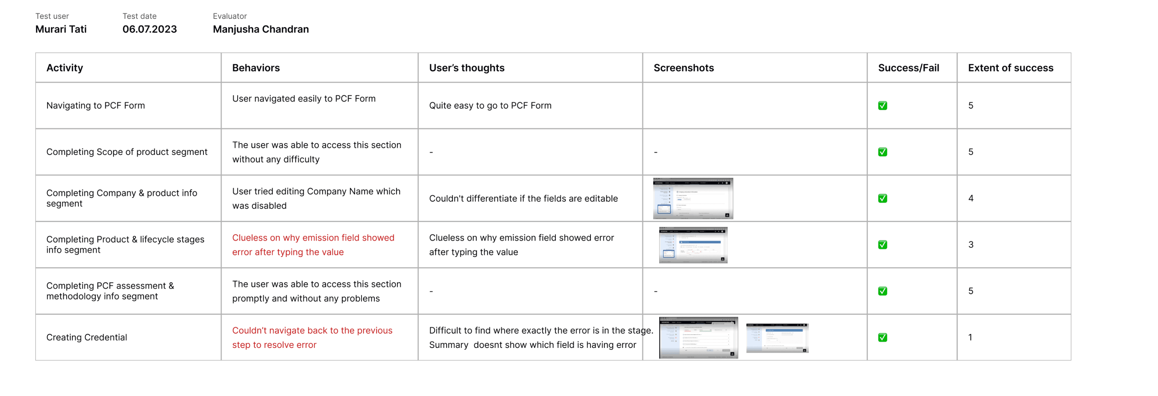
Sample report findings from one of the user
Three problems kept appearing

Three problems kept appearing

Users could enter data without understanding its significance

Technical terminology and unclear field requirements meant people could progress while remaining uncertain about what they were submitting.

Many fields are unclear or too technical. I need to google what that means.
Jargon

Errors were detected, but not recoverable

Users knew something was wrong but struggled to identify which field had caused it or how to return to the right place

It feels outdated and not intuitive.
Dated feel

The information architecture made progress difficult to judge

A large number of visually similar stages made the form feel longer and left users unsure about what remained

It feels overwhelming at first glance with so many sub-stages.
Overwhelm

Users could enter data without understanding its significance

Technical terminology and unclear field requirements meant people could progress while remaining uncertain about what they were submitting.

I just fill it line by line, but I'm not always sure what's needed.
Unclear expectations
Benchmarked against

Structured, high-stakes forms that already handle staged, standardized input for patterns worth borrowing and pitfalls worth avoiding.

Catena
TFS
Income tax forms
Industry standards

Catena-X and TfS are particularly relevant because Siemens itself supports those PCF standards
Tax workflows:
progressive disclosure and clear review before submission
Catena-X / TfS: alignment between form structure and reporting schema
Existing enterprise flows: preserving context while navigating long multi-stage tasks

2 workshops and multiple iterations later

2 workshops and multiple iterations later

  • Skating on one leg
  • Riding a bicycle with V sign
  • A boat in the sea
  • Skating on one leg
  • Skating on one leg
  • Skating on one leg
  • Riding a bicycle with V sign
  • A boat in the sea
  • Skating on one leg
  • Skating on one leg

Iteration 1 - Flatten the workflow
Reduced nested navigation, but still exposed too much information at once.

Iteration 2 - Progressive stages
Improved orientation, but users still struggled to locate incomplete fields.

Iteration 3 - Hierarchical progress + error states
Made the completion state visible at both the stage and substage level.

Simplifying the experience couldn't mean simplifying the data

Simplifying the experience couldn't mean simplifying the data

The constraint: The PCF structure had to preserve the information required by SiGREEN's supported reporting standards. Removing fields could make the form shorter while weakening the data entering the network.

So the redesign focused on how complexity was presented: sequencing fields, grouping related inputs, revealing stages progressively and improving guidance, while retaining the underlying reporting structure.

The constraint: The PCF structure had to preserve the information required by SiGREEN's supported reporting standards. Removing fields could make the form shorter while weakening the data entering the network.

So the redesign focused on how complexity was presented: sequencing fields, grouping related inputs, revealing stages progressively and improving guidance, while retaining the underlying reporting structure.

The hard call
Decision: surface data quality during entry, not after submission
WhyUsers couldn't tell how a field affected data quality โ€” so weak values slipped through to a trust network where one bad input skews every downstream carbon calculation.
What it changedLive good / average / poor scoring per field makes data integrity something users own while filling, not something QA catches after. That's the difference between a form and a source of truth.

Solution

Solution

Guided progression โ€“ Make a long task feel finite

Guided progression โ€“ Make a long task feel finite

The PCF was reorganised into five stages with nested progress visible throughout. Users could see their current position, completed sections and remaining questions without scanning the entire form.

The form is split into five focused stages, shown one at a time. A persistent stepper tells users where they are and how many questions remain in each substage, so the experience reads as steady progress instead of an overwhelming wall of fields.

In-context glossary - Keep technical guidance inside the task

In-context glossary - Keep technical guidance inside the task

Users were leaving SiGREEN to look up unfamiliar PCF terminology. I added an in-context glossary that opens alongside the form, so definitions remain available without interrupting progress or adding explanatory copy to every field

Users were leaving SiGREEN to look up unfamiliar PCF terminology. I added an in-context glossary that opens alongside the form, so definitions remain available without interrupting progress or adding explanatory copy to every field

Lifecycle stages - Organise emissions around the way the data is understood

Lifecycle stages - Organise emissions around the way the data is understood

Instead of repeating the same interaction pattern for each emission type, related emissions were grouped under their lifecycle stage. This reduced repetition in the interface while keeping the structure extensible as additional emission types were introduced

Instead of repeating the same interaction pattern for each emission type, related emissions were grouped under their lifecycle stage. This reduced repetition in the interface while keeping the structure extensible as additional emission types were introduced

Error recovery โ€“ make errors traceable across a nested form

Error recovery โ€“ make errors traceable across a nested form

Testing showed that users could see that the PCF contained an error but struggled to locate the responsible field. Error states now propagate from the field to its substage and parent stage, giving users a direct path back to the problem

Testing showed that users could see that the PCF contained an error but struggled to locate the responsible field. Error states now propagate from the field to its substage and parent stage, giving users a direct path back to the problem

Preview & edit without reopening the workflow

Preview & edit without reopening the workflow

Before submission, users can scan the complete PCF from one place and edit individual sections directly from the review state. This avoids forcing them back through the five-stage sequence simply to correct one value.

A final preview summarises the whole PCF and lets users edit inline, without dropping back into the flow.

PCF Verification - make verification part of the PCF record

PCF Verification - make verification part of the PCF record

Users can record the verification standard and attach supporting certification before review, keeping assurance information alongside the footprint it applies to. Verification also contributes to the assurance signals used when judging the quality of the PCF.

Users can record the verification standard and attach supporting certification before review, keeping assurance information alongside the footprint it applies to. Verification also contributes to the assurance signals used when judging the quality of the PCF.

Data Quality Indicators โ€“ turning labels into scores into something users can act on

Data Quality Indicators โ€“ turning labels into scores into something users can act on

The original experience reduced data quality to a percentage without explaining what was driving it. I introduced four readable states โ€” Excellent, Good, Average and Poor โ€” with a breakdown of the factors contributing to the rating

Outcome

Outcome

In moderated testing with 8 users, participants completed the same PCF task using the original and redesigned workflows.

0%
0%

lower median/average completion time

lower median/average completion time

0%
0%

fewer interaction steps to submit a PCF

fewer interaction steps to submit a PCF

Accessibility

Accessibility

The redesign used Siemens' iX design system throughout, reusing established components for inputs, navigation and feedback while adapting their composition to the requirements of a long, standards-heavy workflow.

The redesign used Siemens' iX design system throughout, reusing established components for inputs, navigation and feedback while adapting their composition to the requirements of a long, standards-heavy workflow.

What I would test next

What I would test next

The usability tests validated the redesigned task flow, but not how it performs with the full variability of real customer PCFs. The next step would be testing against longer, industry-specific datasets to understand where the staged architecture, validation and quality feedback begin to break down

The usability tests validated the redesigned task flow, but not how it performs with the full variability of real customer PCFs. The next step would be testing against longer, industry-specific datasets to understand where the staged architecture, validation and quality feedback begin to break down

Learnings & Takeaways

Learnings & Takeaways

Working on one of the product's most-used features was both challenging and gratifying โ€” here's what it taught me.

Working on one of the product's most-used features was both challenging and gratifying โ€” here's what it taught me.

01
Complexity can be reorganised even when it cannot be removedThe reporting requirements meant most of the underlying data had to stay. The largest usability gains came from changing when information appeared, how it was grouped and how users moved through itโ€”not from stripping the workflow down.
02
Enterprise form design starts with information architectureThe hardest decisions were not field styling or component choice. They were deciding how reporting standards, lifecycle stages, validation states and review behaviour should fit into one model that could keep evolving.

To befriend or hire me, reach out on

Before you go, leave a doodle/note for me or take a little piece of my hometown with you.

untitled - Paint
โ€“
โ–ก
โœ•
FileEditViewImageOptions
For Help, click Help Topics on the Help Menu.
SURPRISE ME

Made with love & a lot of caffeine by

ยฉ2026 All rights reserved

To befriend or hire me, reach out on

Before you go, leave a doodle/note for me or take a little piece of my hometown with you.

untitled - Paint
โ€“
โ–ก
โœ•
FileEditViewImageOptions
For Help, click Help Topics on the Help Menu.
SURPRISE ME

Made with love & a lot of caffeine by

ยฉ2026 All rights reserved